Pronoun Pins
Client
Fenway Health
Location
Boston, MA
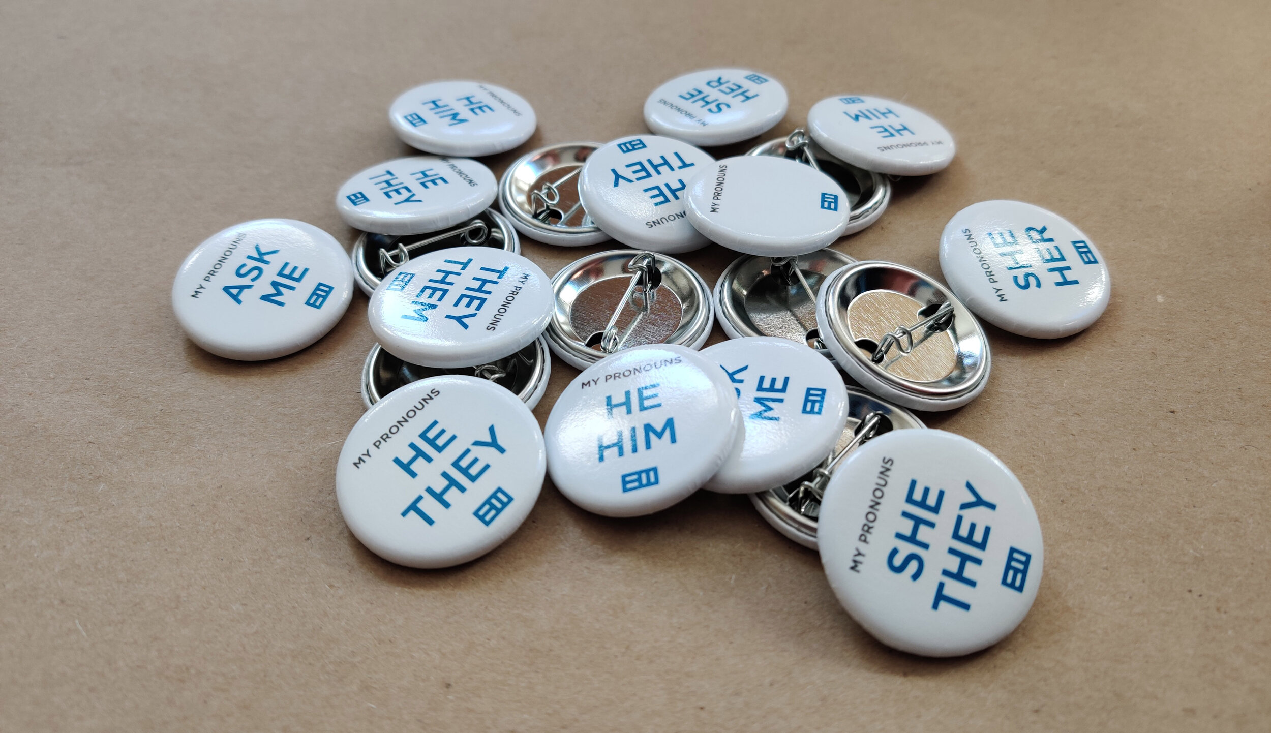
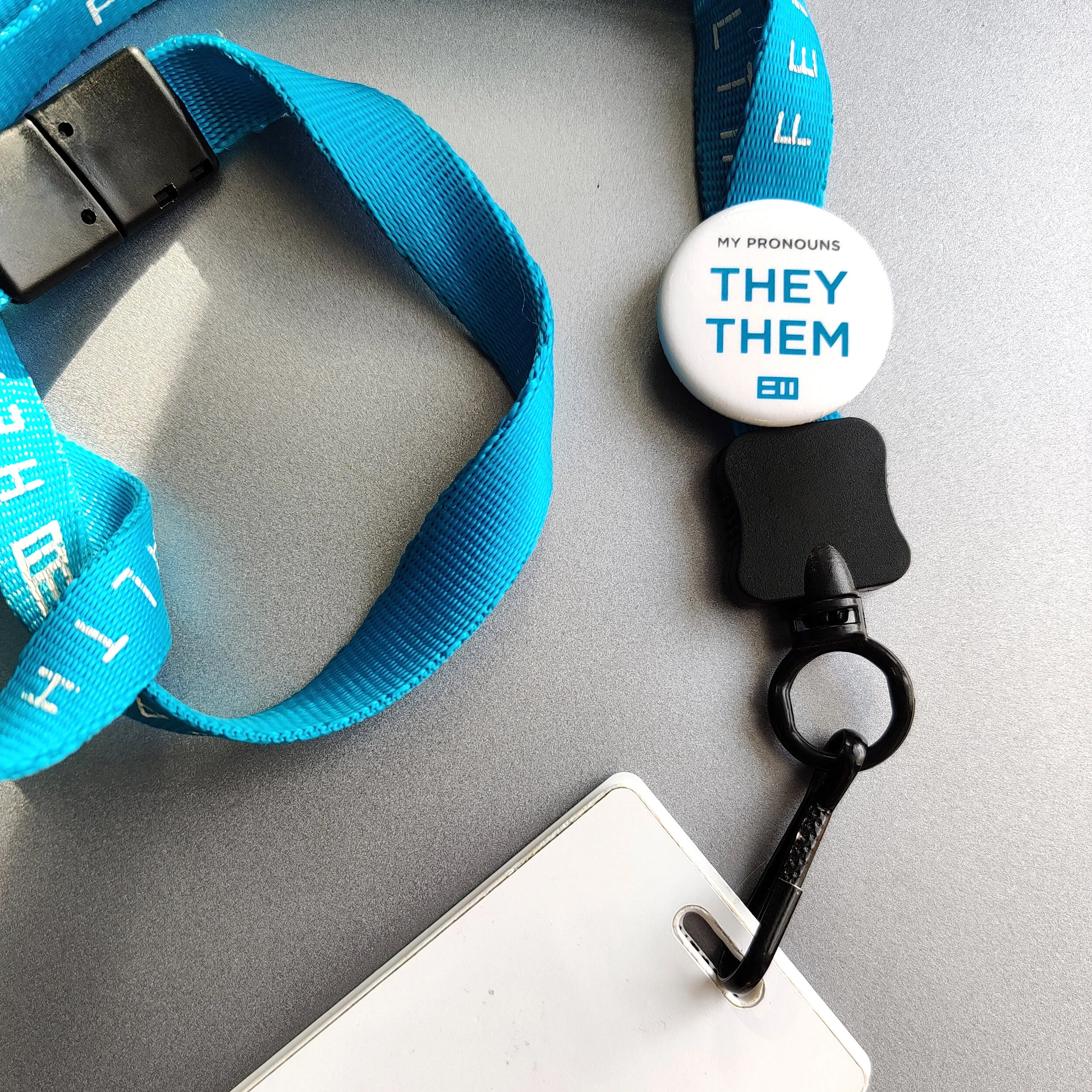
As a community health center with a focus on the LGBTQ community, Fenway Health launched an initiative to put a greater emphasis on pronouns. To support this, they needed to refresh their pronoun pins.
Fenway Health has been a leader in LGBTQ health since its founding in the 1970s. The needs of the community are constantly changing and with them, standard approaches to care also need to adapt. To better meet their mission of enhancing the wellness of the patients they serve, Fenway Health committed to a new emphasis on pronouns within their health centers. They previously had pronoun pins available to staff. However, these pins were overly large and clunky to wear and were only available in three variants: she/her, he/him and they/them. The text on the pins was small despite the large size and they needed to be easier to read quickly. Fenway also wanted to offer a wider range of pronoun options.
The goal of this project was to redesign the pins to be a more convenient size and to better emphasize the pronoun information. This initiative also had to be introduced to patients. This was ultimately achieved with a combination of signage through the health centers and pronoun stickers that were available to patients at the registration desk on each floor.
Process
The Transgender Health program at Fenway Health identified a list of seven pin variants: she/her, he/him, they/them, she/they, he/they, ask me and a blank pin that could be written on. The last two options offer a significant amount of flexibility for individuals whose pronouns change and/or would prefer to be asked, or those who use pronouns other than those provided on the pins.
The first step was to determine the size for these pins. The existing pins were 2.25” in diameter and many staff had complained about them getting caught on things and generally being too large to be comfortable. In order to make these convenient to wear, and therefore encourage staff to use them, they needed to be as small as possible while still fitting the necessary information. I printed out a variety of size options, gathered feedback and determined that the final pins would measure 1.25” in diameter. Next, I identified the three vital components as the phrase “My Pronouns,” the pronoun information, and the Fenway Health icon. Of these three, the pronoun information was the most important and most of the space on the pin needed to be dedicated to that text. The typeface and colors were determined by the Fenway Health brand guidelines to ensure these pins blended seamlessly with the identity of the health center.
Additional Components
The poster above was designed to serve as a visual introduction to the pronoun pins worn by staff and prepare patients for the new procedure of asking every patient their pronouns at each visit. The goal was to normalize pronouns as a regular part of a doctor’s visit, just like taking other vital signs such as temperature and blood pressure. The pins serve as a physical representation of an intangible and often complicated part of a person’s identity and are therefore a useful design element. The combination of the posters and the pins worn by staff will help introduce the importance of pronouns to patients that may not be accustomed to talking about them, or gender more generally.
The stickers above are based on the blank pin design available to staff. Rather than offer seven different sticker options, this was the best solution to accommodate the wide range of gender identities of Fenway Health’s patients while being simple and inexpensive to maintain. The stickers are available at the registration desk on each floor of the health center. Several stickers are displayed with pronouns written on them, and pens are available beside the stickers to indicate their purpose to patients. The stickers are completely optional, just as the pins are optional for staff.


