Fenway Health Pride
Client
Fenway Health
Location
Boston, MA
Each year, Fenway Health employees, friends and family march together in the Boston Pride Parade. They needed a bold design for a shirt to make their group stand out on the parade route.
Fenway Health has participated in the Boston Pride Parade for many years and each year, they use a custom shirt to unify their group and clearly identify their presence. After a company scandal several years ago, they have focused their efforts on rebuilding trust within their community. Many efforts have been made to begin a new chapter that honors the founding mission and values of the organization. As a community health center, they have deep roots in the Fenway neighborhood and the core of their mission is to serve the needs of this community. The complementary concepts of new growth and deep roots were what they wanted to clearly emphasize in their parade presence.
The parade committee decided to decorate their float in a garden theme to visually represent the new growth the organization is emphasizing. The combination of the luscious garden float and the vibrant green shirts created a striking contrast in the route and allowed the Fenway Health group to be clearly visible.
Process
I was invited to participate in the parade committee meetings. The committee itself was comprised of employees from many different departments and therefore included a wide range of perspectives. The first meeting started with a discussion of past parades and what they liked and disliked about the previous float and shirt designs. This information gave me a general foundation for the design process. The conversation quickly turned to the fundamental message they hoped to convey in the upcoming parade. Many agreed that the primary goal had to be to emphasize the positive growth of the organization while also recognizing their long and vibrant history.
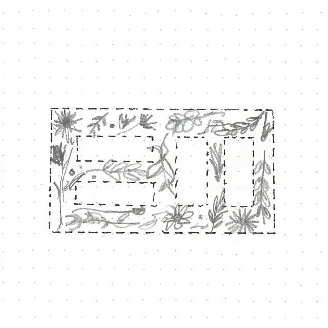
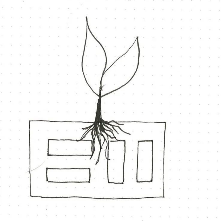
This first meeting concluded with a brainstorming session for potential slogans, including “Grow With Us,” “Together We Flourish,” and “Rooted In Our Community.” I identified the essential components for the design as the Fenway Health logo, botanical elements that demonstrated growth, and roots that represented a foundation in the community. With these elements as a starting point, I sketched several initial concepts. From the sketches, I began exploring the concepts digitally. At this point, I evaluated each option for both visual and conceptual strength. I also asked for input from other members of the Communications team.
Final Concept
The final concept combined two of the initial ideas. The negative space created in the Fenway logo by the roots was visually striking and clearly conveyed the origins of the organization within the community. However, the seedling conflicted with Fenway Health’s long history. Using a full grown tree better reflects and honors the age of the organization and still conveys new growth as part of the annual cycle of growing new leaves. For the slogan on the back, I selected “Rooted in our Community” as it works well conceptually and is a powerful phrase that concisely communicates the intended message.
To create a design that was viable to print, I worked with a palette of two colors. Most organizations use a combination of black shirts with rainbow printing for Pride. Given that Fenway Health wanted to stand out and was using a theme of growth, I decided that a green shirt with green and brown printing would accomplish that goal and align with the theme.


